TECHLAND
Logo Redesign & Rebranding -// 2022
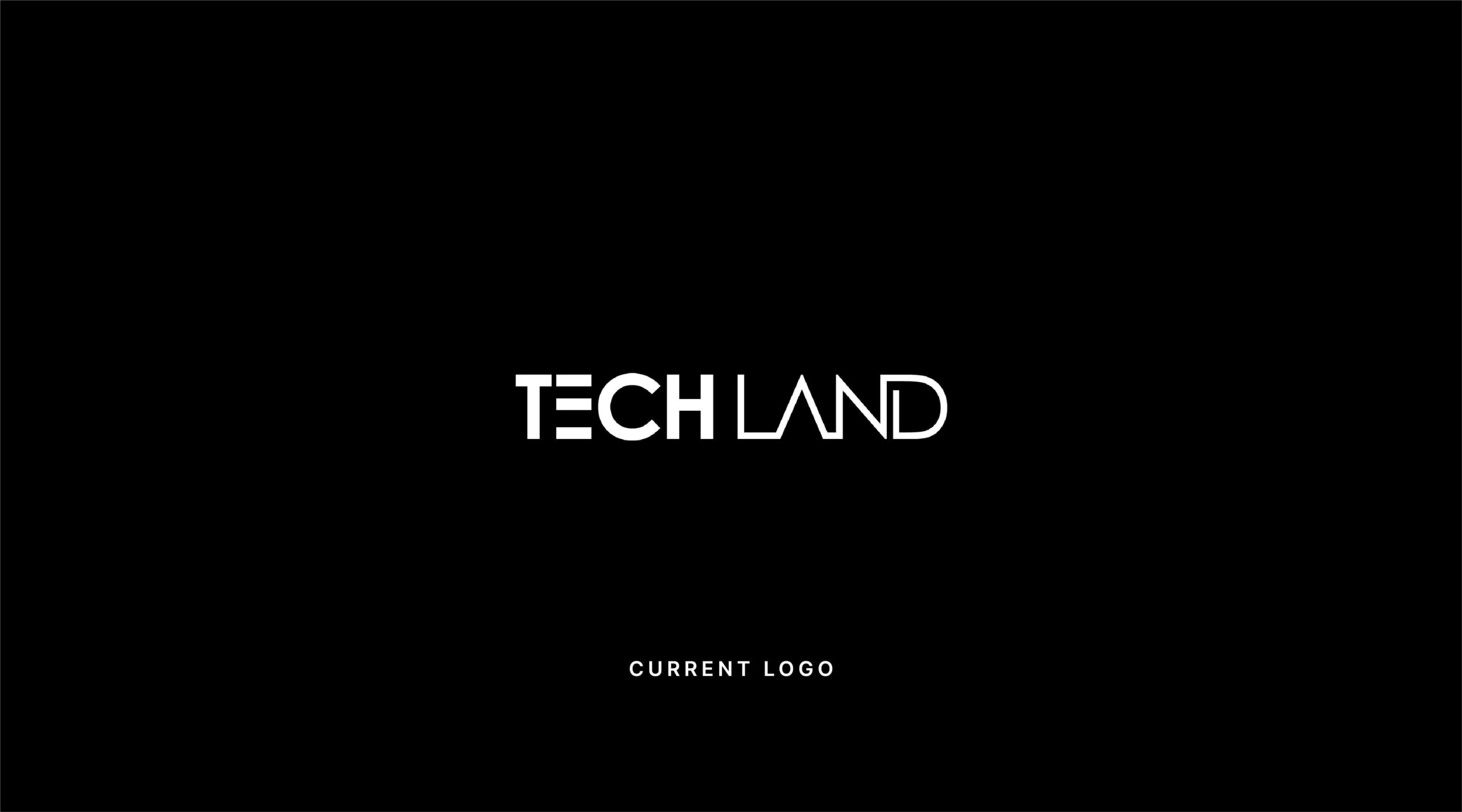


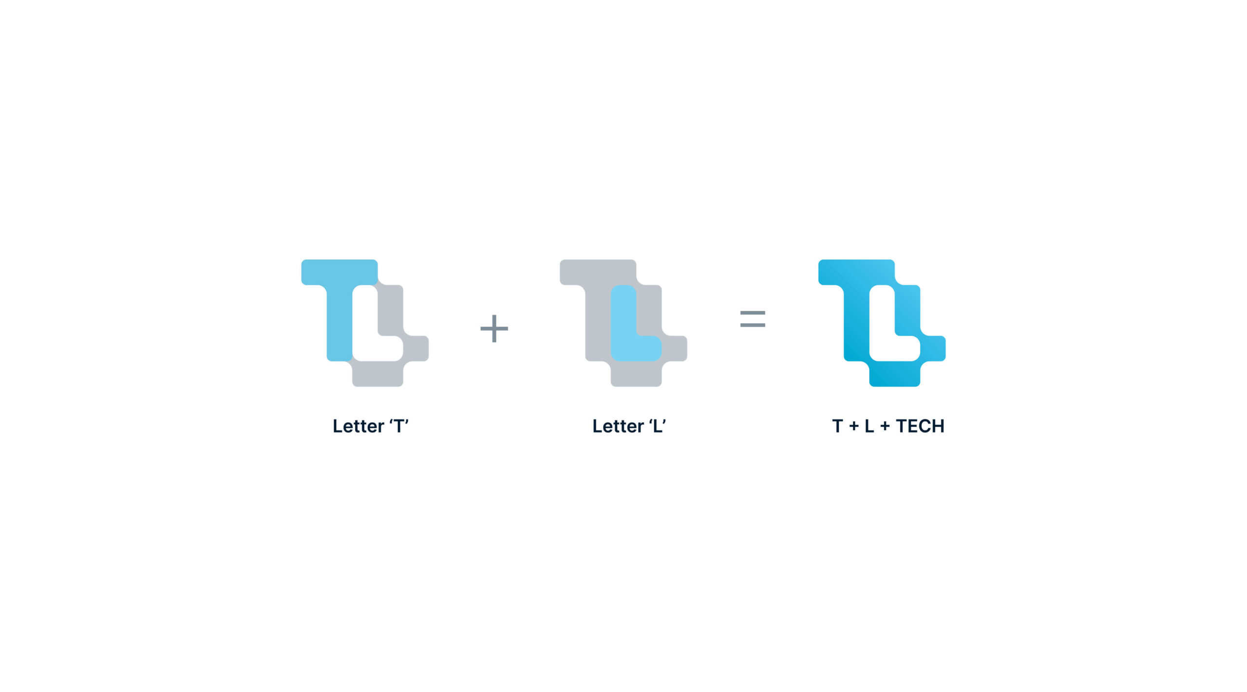
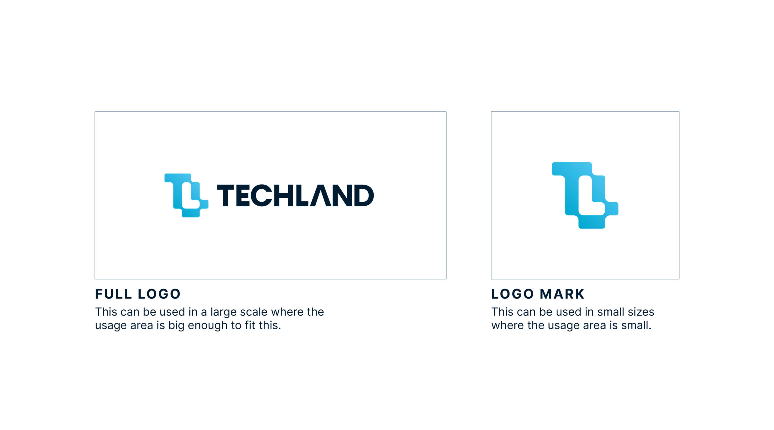
The logo mark is made based on the nature and personality of the brand. It is a modern mark based on two letters T+L which are extracted from the name TechLand. The L is placed as a negative space object in the logo. Basically, the logo has a tech vibe with those two letters.
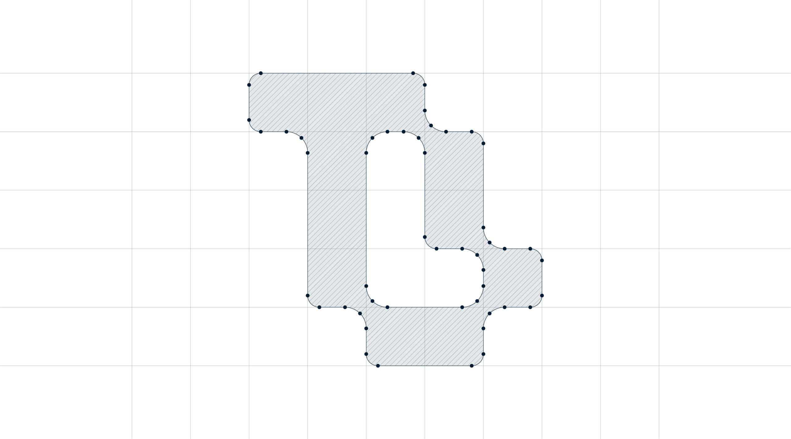
A logo grid, also known as a construction grid or logo grid system, is a framework used by designers to create precise and proportionate logo designs. It serves as a guide that helps maintain consistency, balance, and harmony within a logo’s elements. The purpose of a logo grid is to ensure that the logo’s elements are properly spaced, aligned, and sized, resulting in a visually pleasing and well-structured design. This new logo is made using logo grid and it is perfectly balanced and proportioned using grid system.

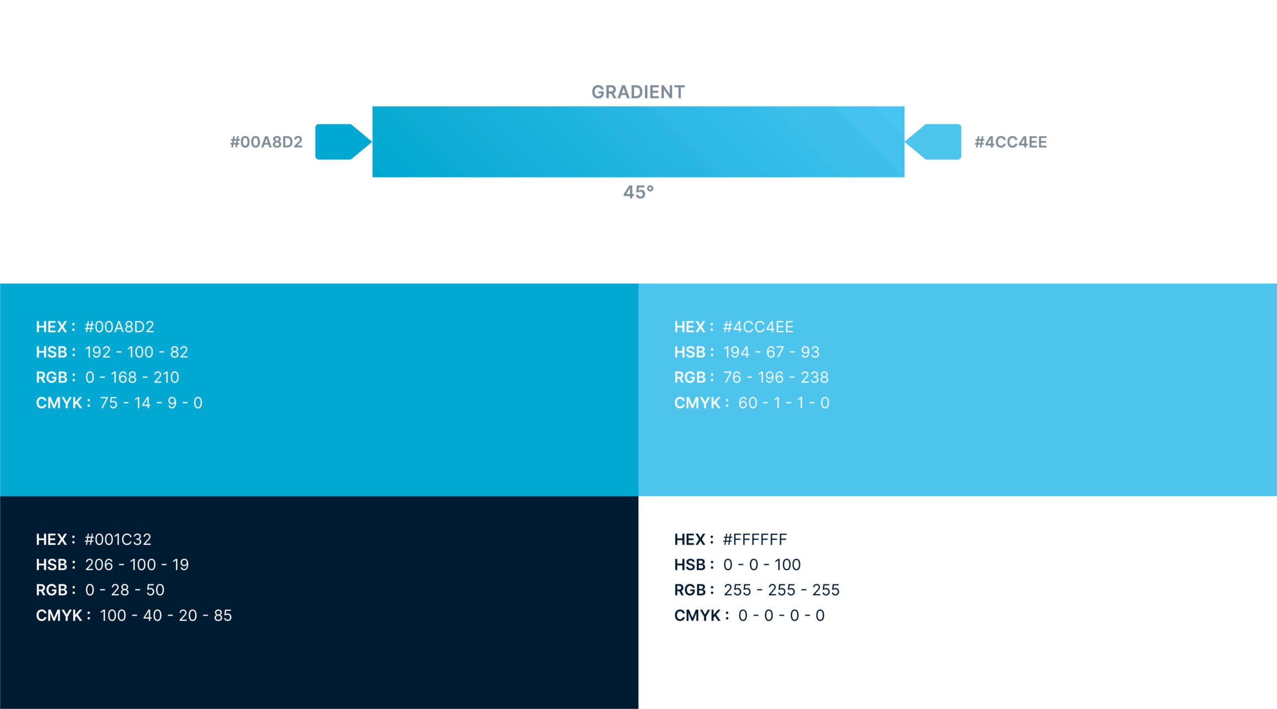
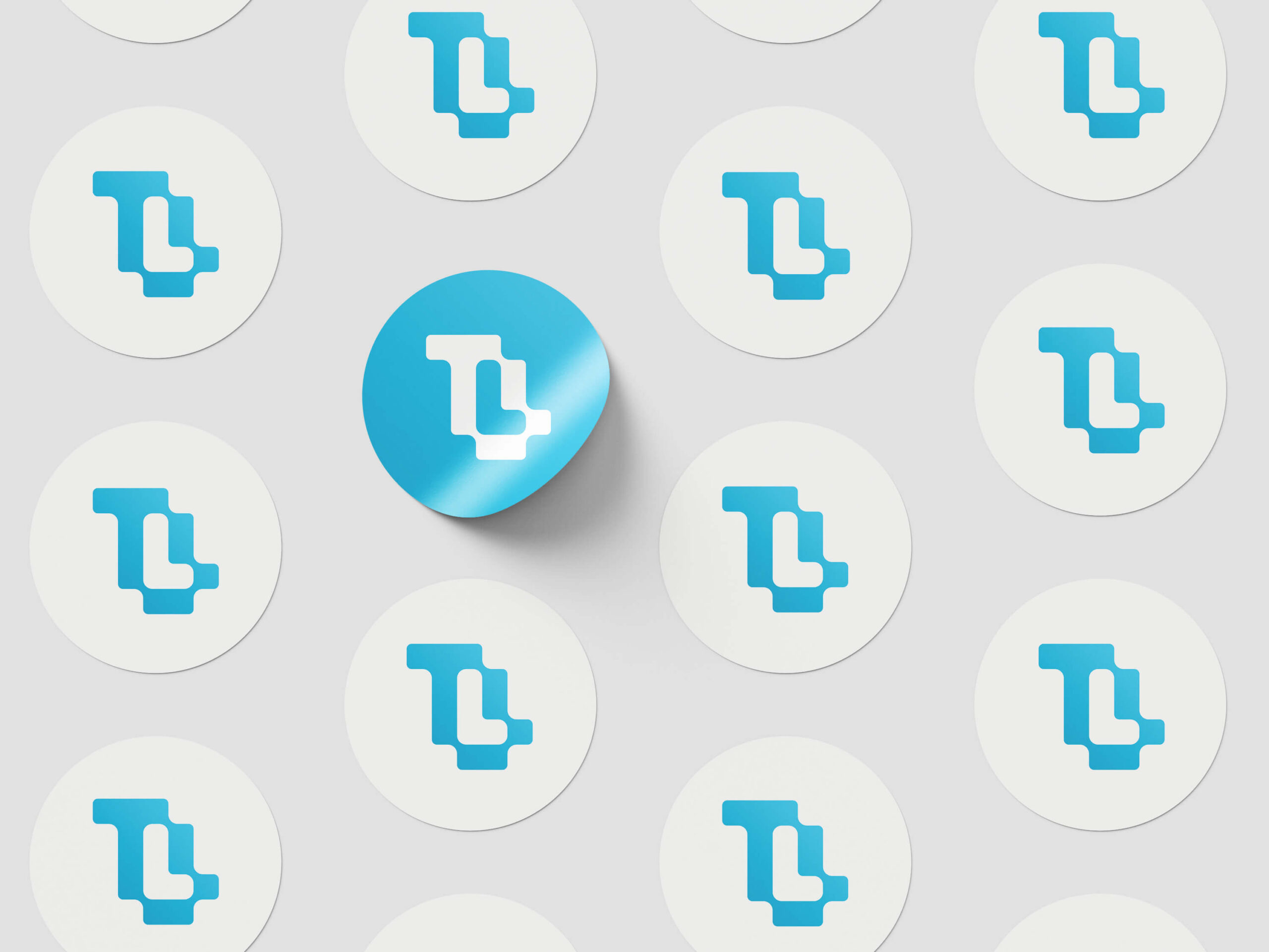
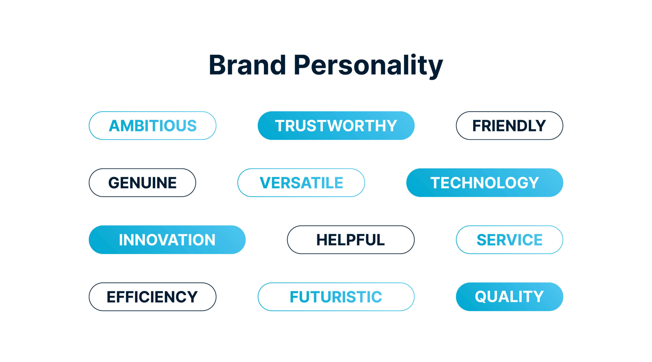
The colors are chosen based on the personality of the brand. As it is a brand that is related to the tech industry cool side of the color wheel is the best choice. So, we have chosen blue as the primary color of the brand. Blue is a color that evokes calmness, trust, stability, confidence, and professionalism. That’s why Blue can be a perfect fit for the brand. Also, it is important to have a pattern that can be used on different products or packaging. So, this simple pattern was created with the logo mark.

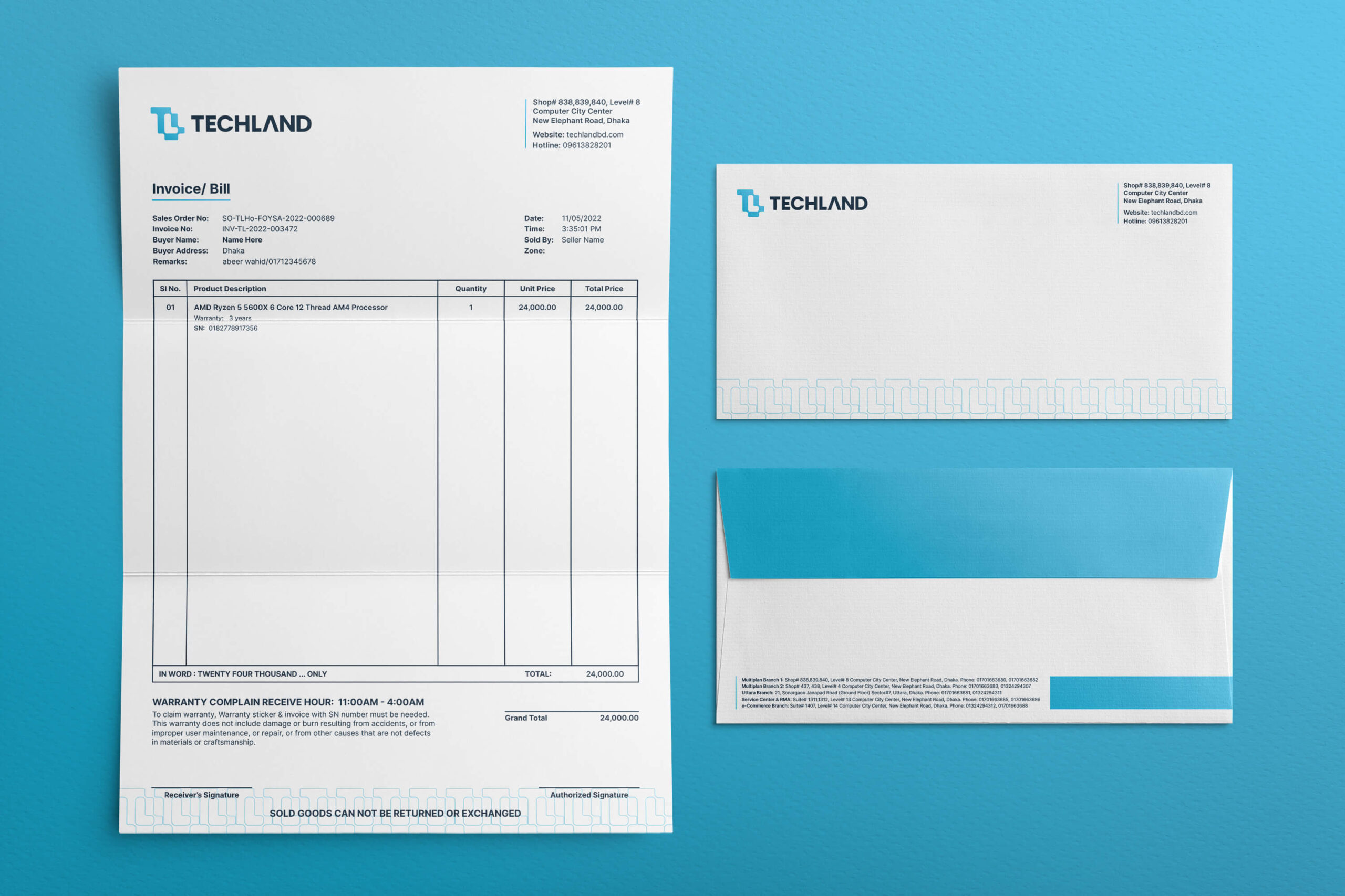
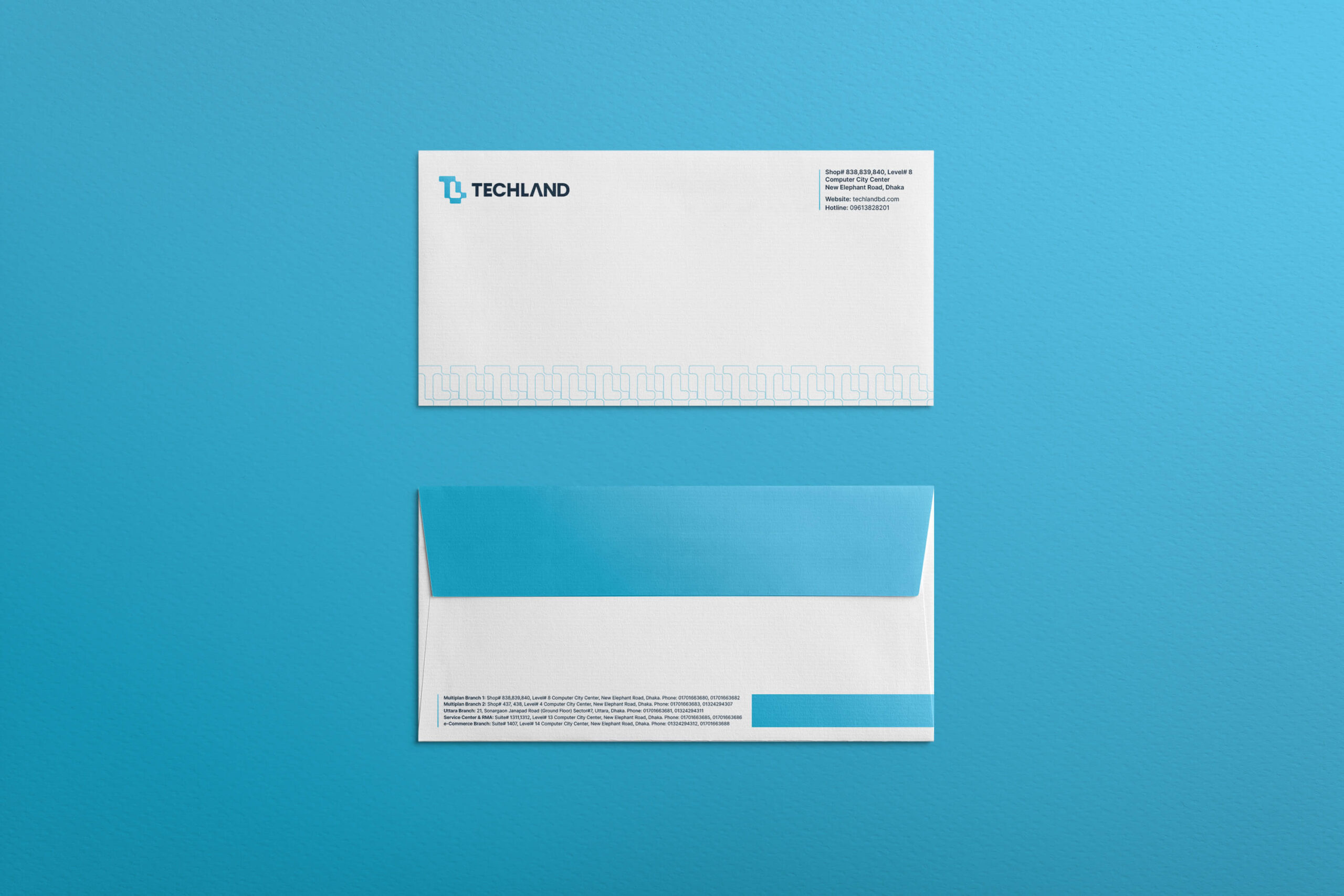
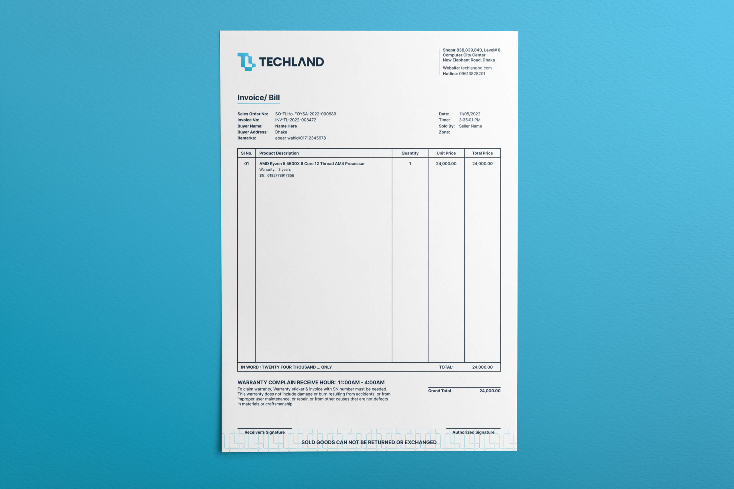
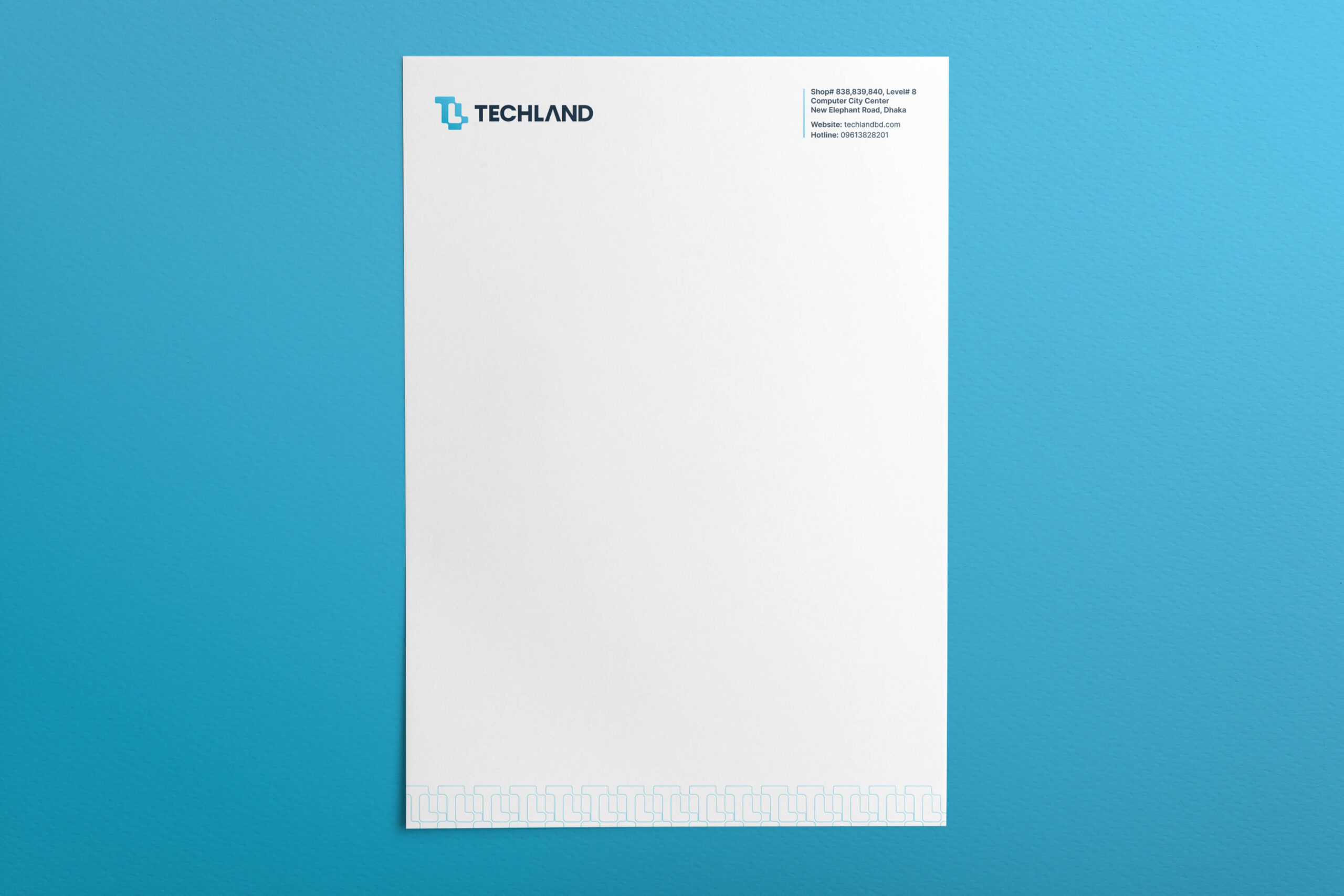
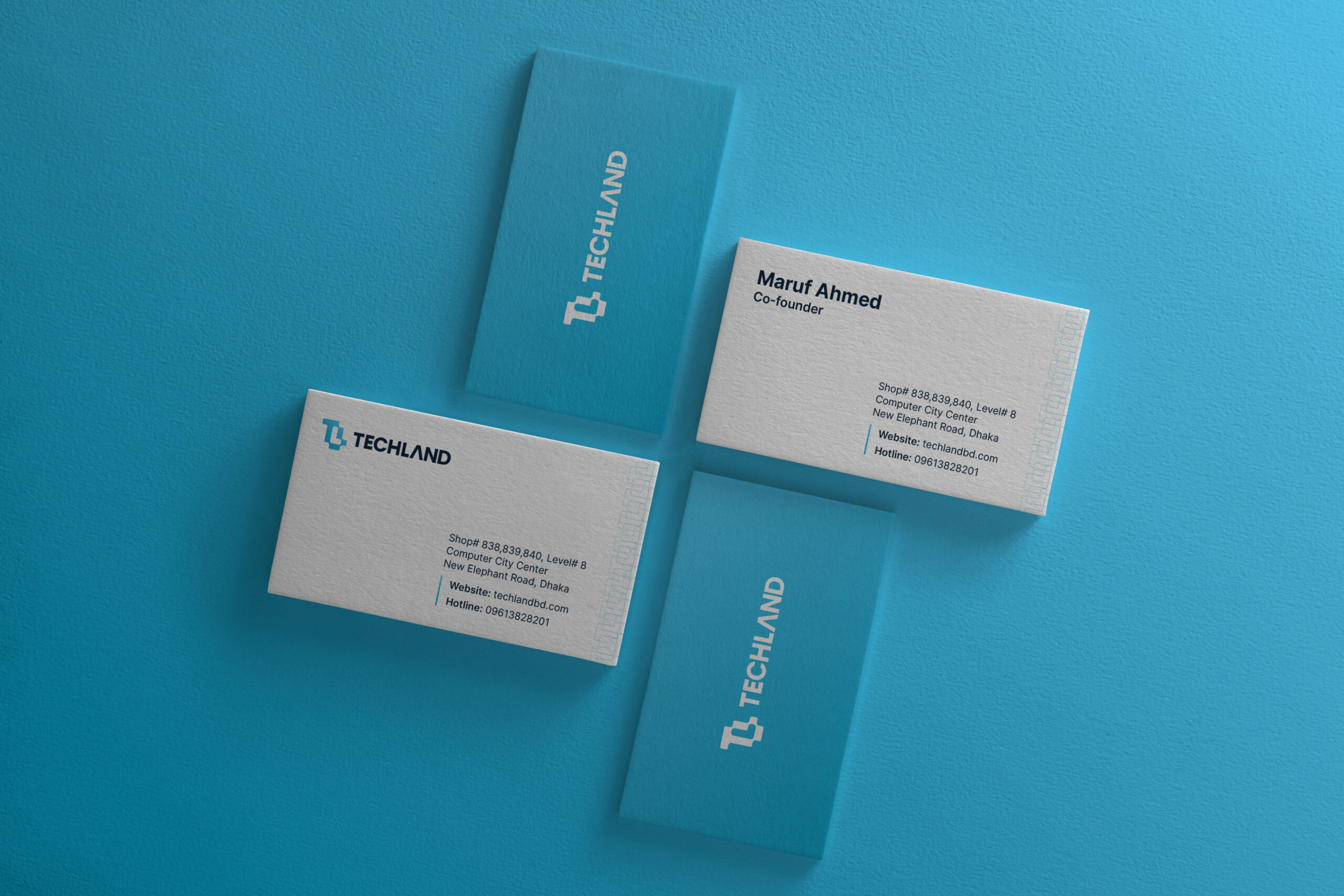
As a computer and tech service provider, it is necessary to have branded stationeries such as letterhead, invoices, envelopes, business cards, etc. So we have designed these stationeries with branded elements and colors to keep the consistency of the brand.
