Marufiam

ETHRE

Logo Design -// 2022
Project Completed: June 2022
Client: Nick Thomas
Project Scope: Logo Design
Designer: Maruf Ahmed
Role: Logo Designer
ABOUT

ETHRE is a truly remarkable brand when it comes to sportswear. They have managed to create a perfect balance between style, performance, and innovation, which is no small feat. This brand is not only dedicated to creating products that look great but ones that actually perform the way they should. The range of sportswear and activewear they offer is second to none and it has been designed specifically for athletes and fitness enthusiasts.

Their sportswear is not only functional but also of high quality, ensuring that athletes and fitness enthusiasts are fully equipped to take on their physical challenges with ease. I was lucky enough to work with ETHRE and help them design their innovative logo.
LOGO
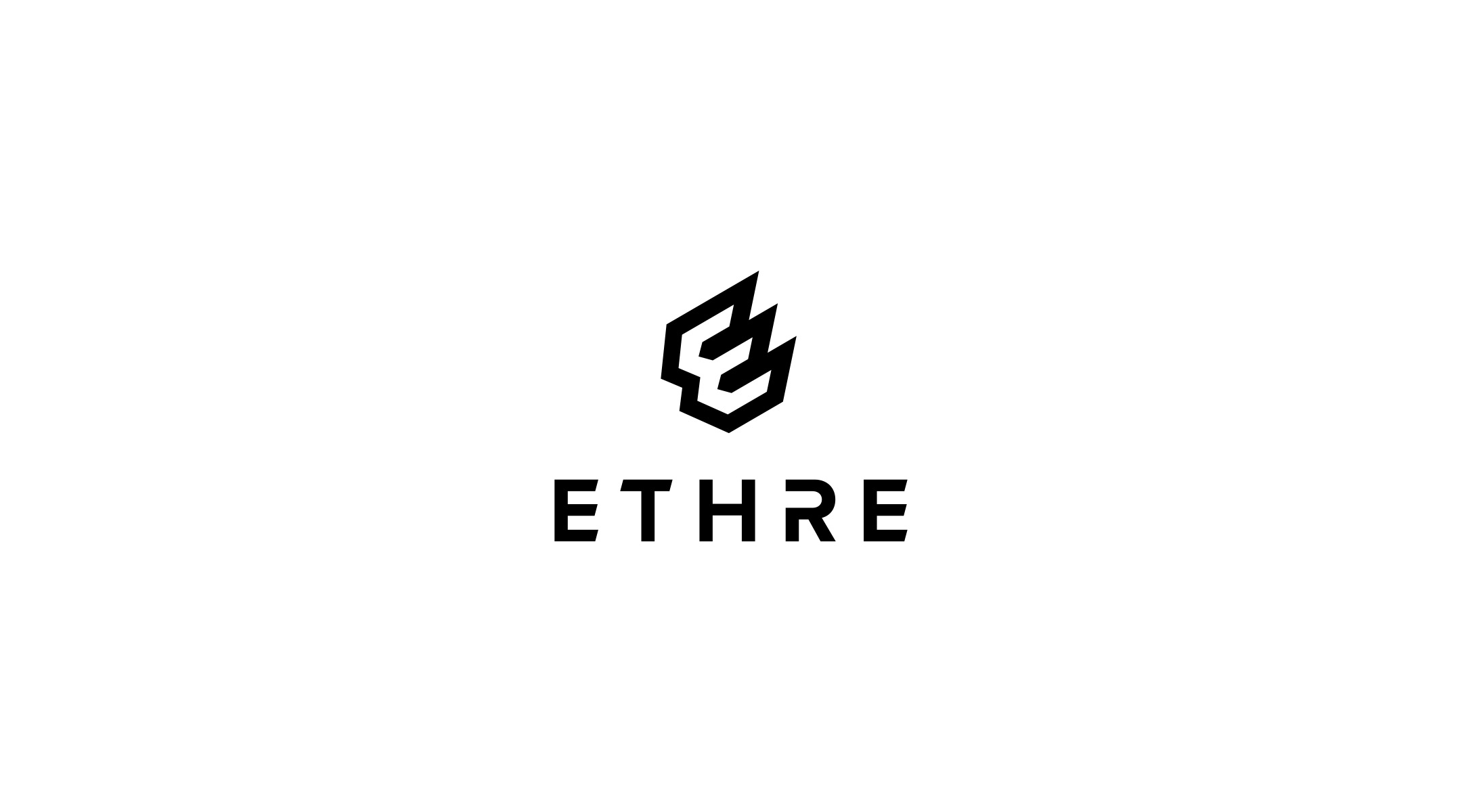
The logo is a modern and bold logo with a unique logo mark and custom logotype. The logo is a fully responsive logo that is made based on the nature of the brand. The logo has a strong, bold, and solid vibe, which represents the true nature of the brand.
LOGO STYLE
The logo has two different styles, horizontal and vertical. Both of them can be used based on the situation and the space. This means the logo can be used everywhere without losing its actual identity.
LOGO MARK
A unique logo mark is like the face of the brand. The ETHRE Logo Mark is a modern and unique mark based on the letter E which is the first letter of the name. The mark has a solid and bold vibe to represent the brand’s true potential. This mark can be used in any size without losing its identity.
LOGOTYPE
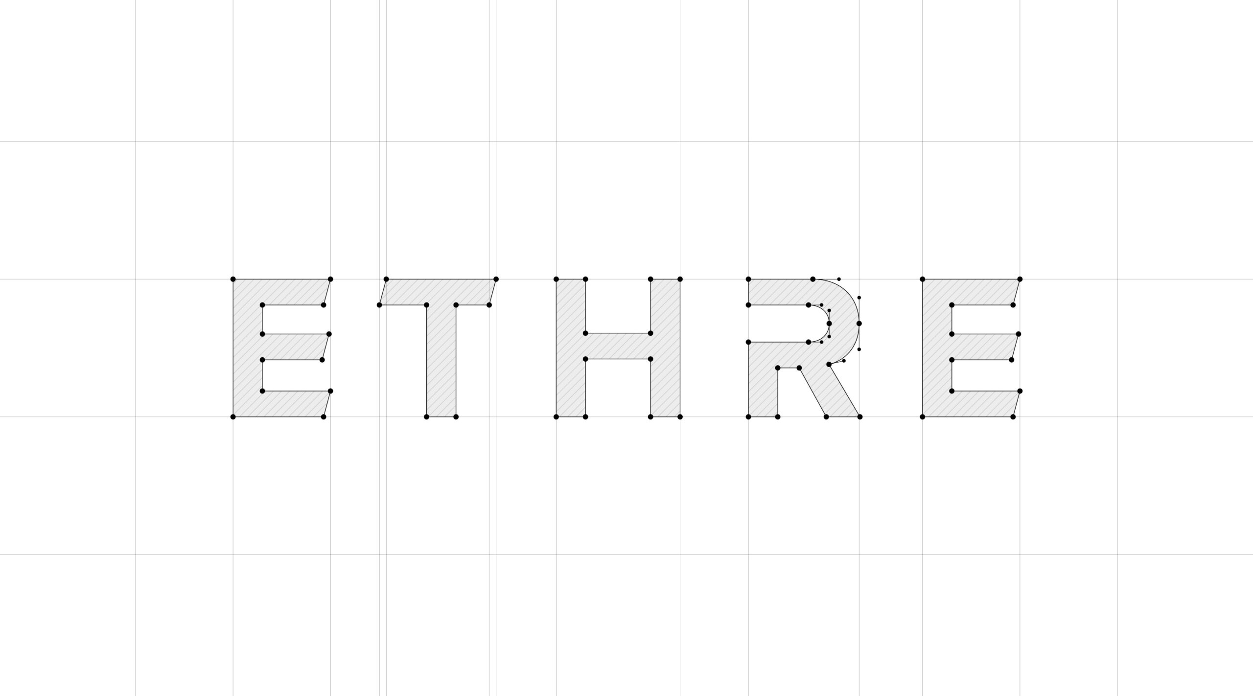
A logotype refers to the typography/ text of the logo. To make the unique logo mark even more impressive, a custom logotype was designed based on the mark. The logotype is a custom-made typography that looks bold and strong.
LOGO GRID

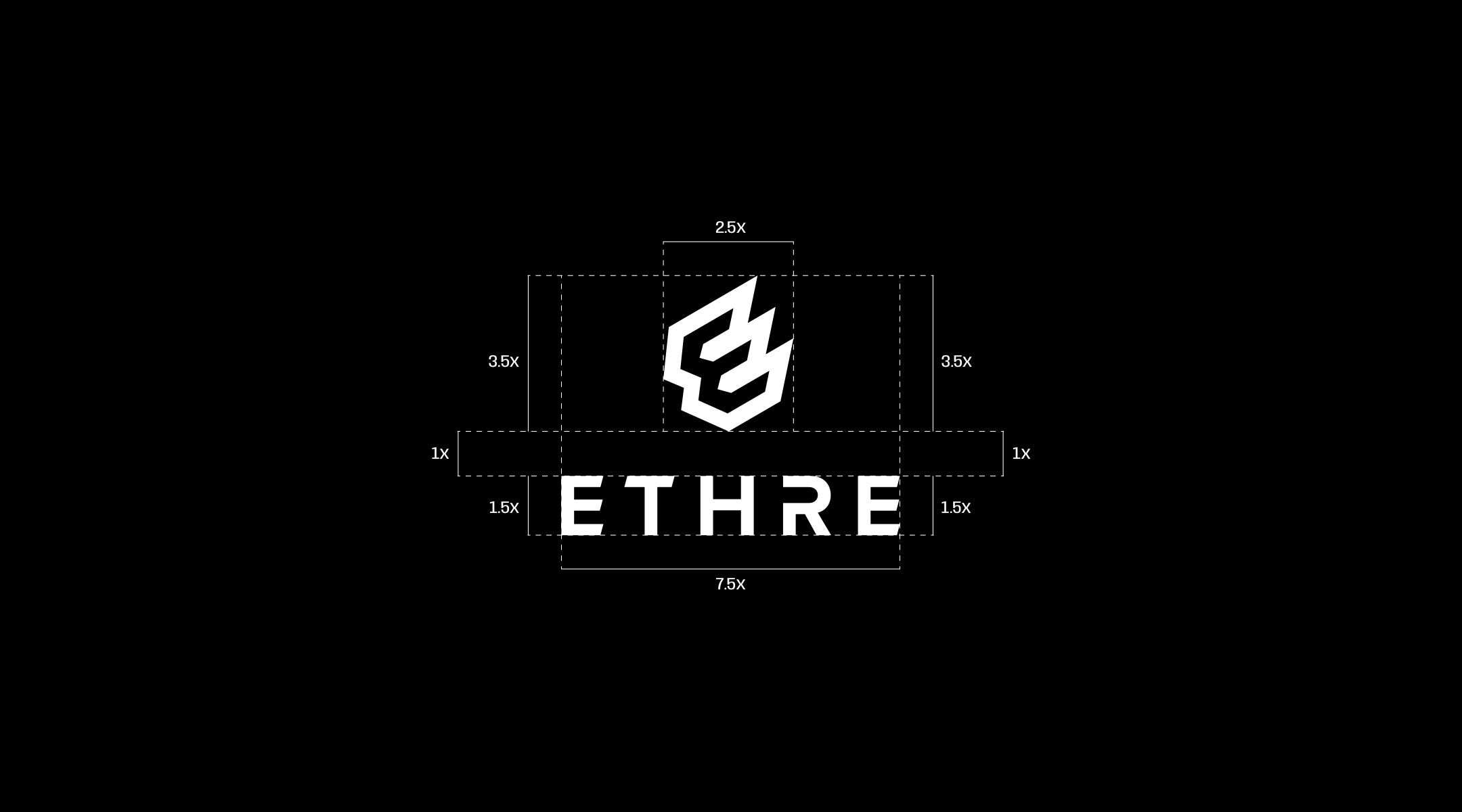
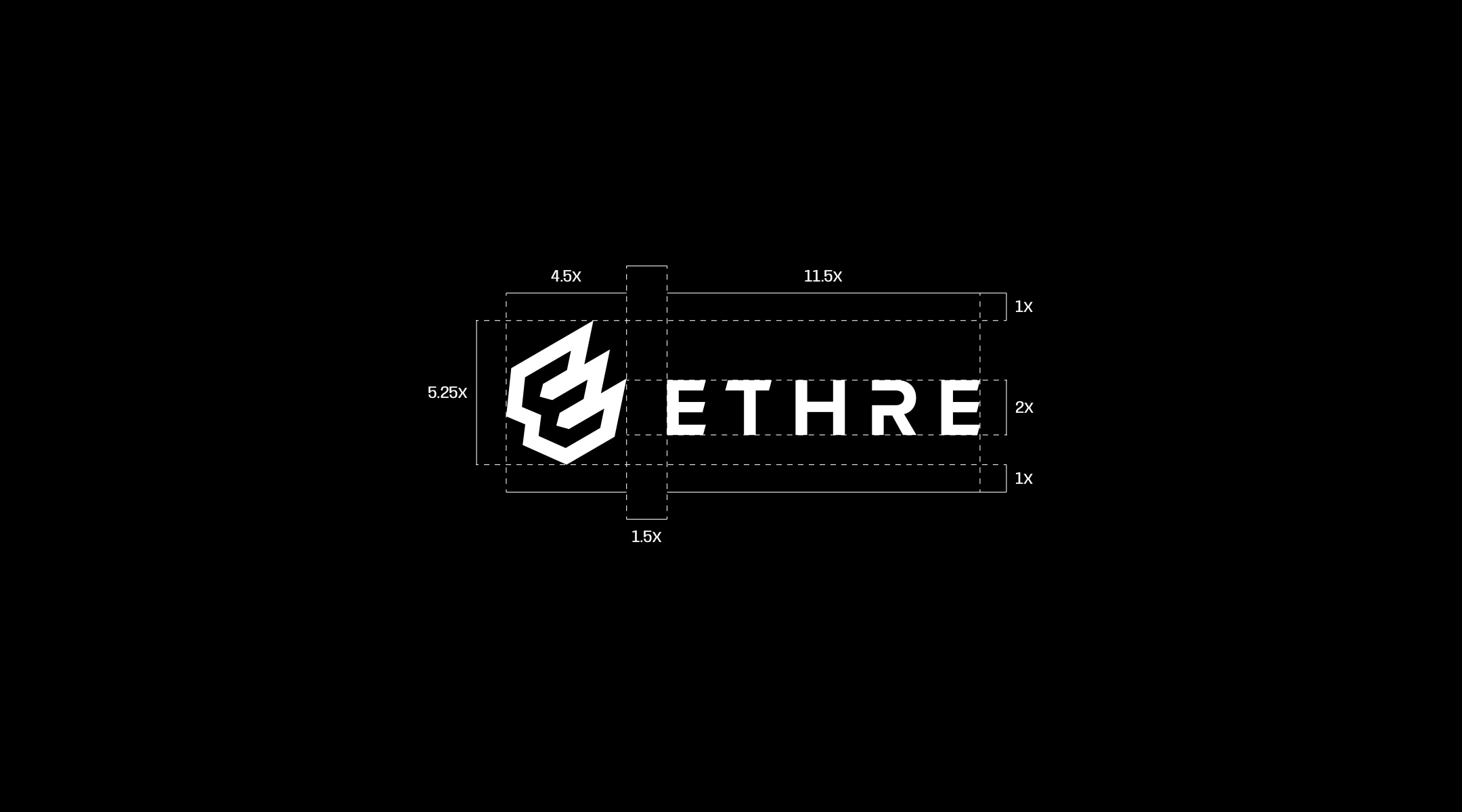
It is a must to perfectly place the logo mark and type to get the best possible outcome. The logo mark and the logotype are proportioned and placed perfectly using the logo grid system. The size and spacing were chosen carefully to make the logo pleasing to the eye.
PATTERN

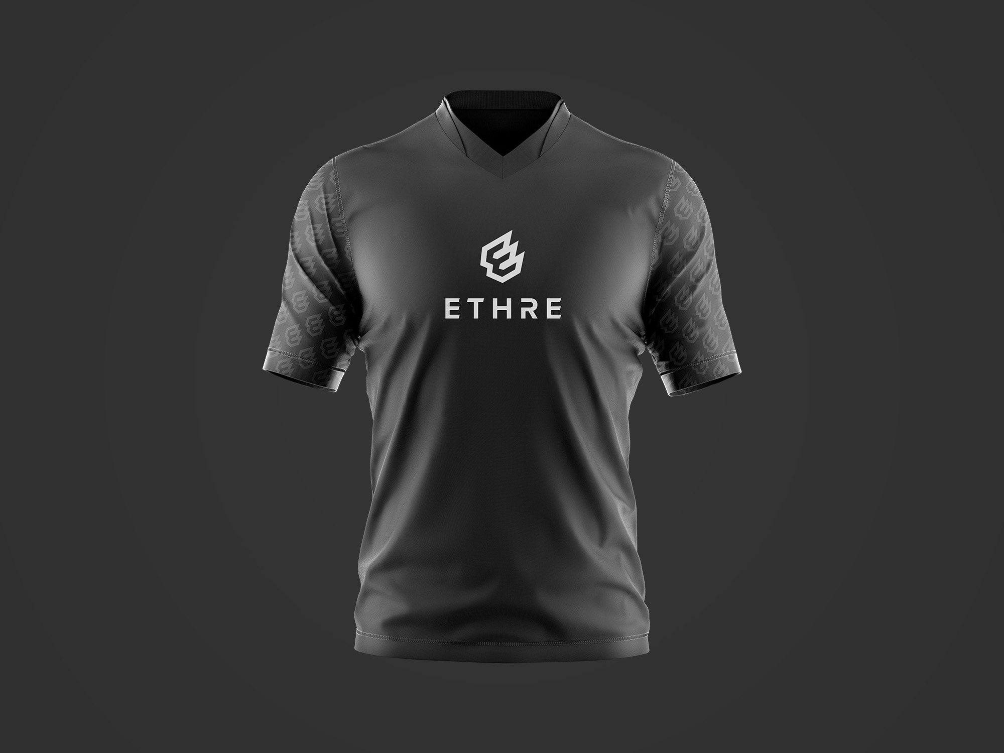
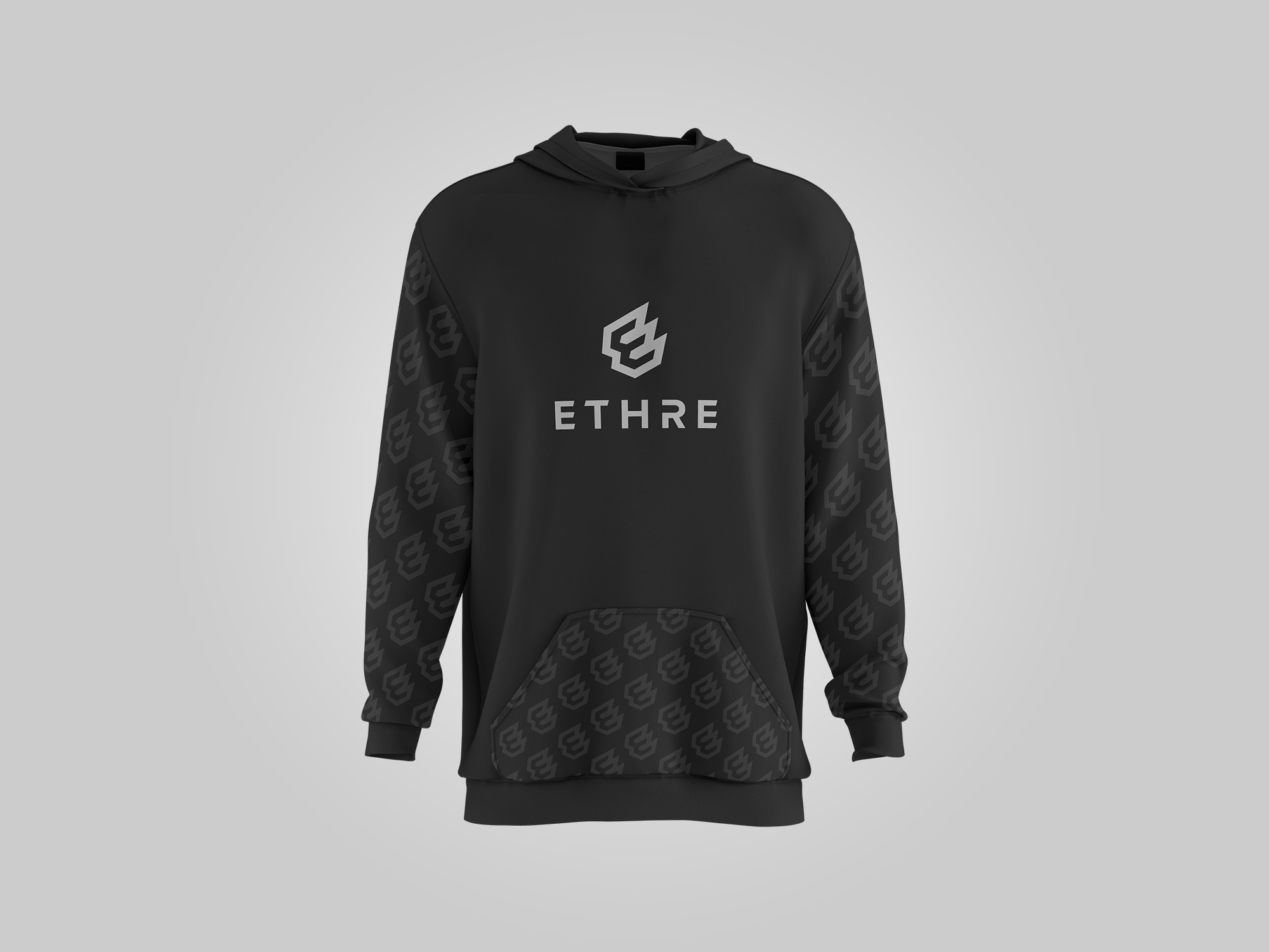
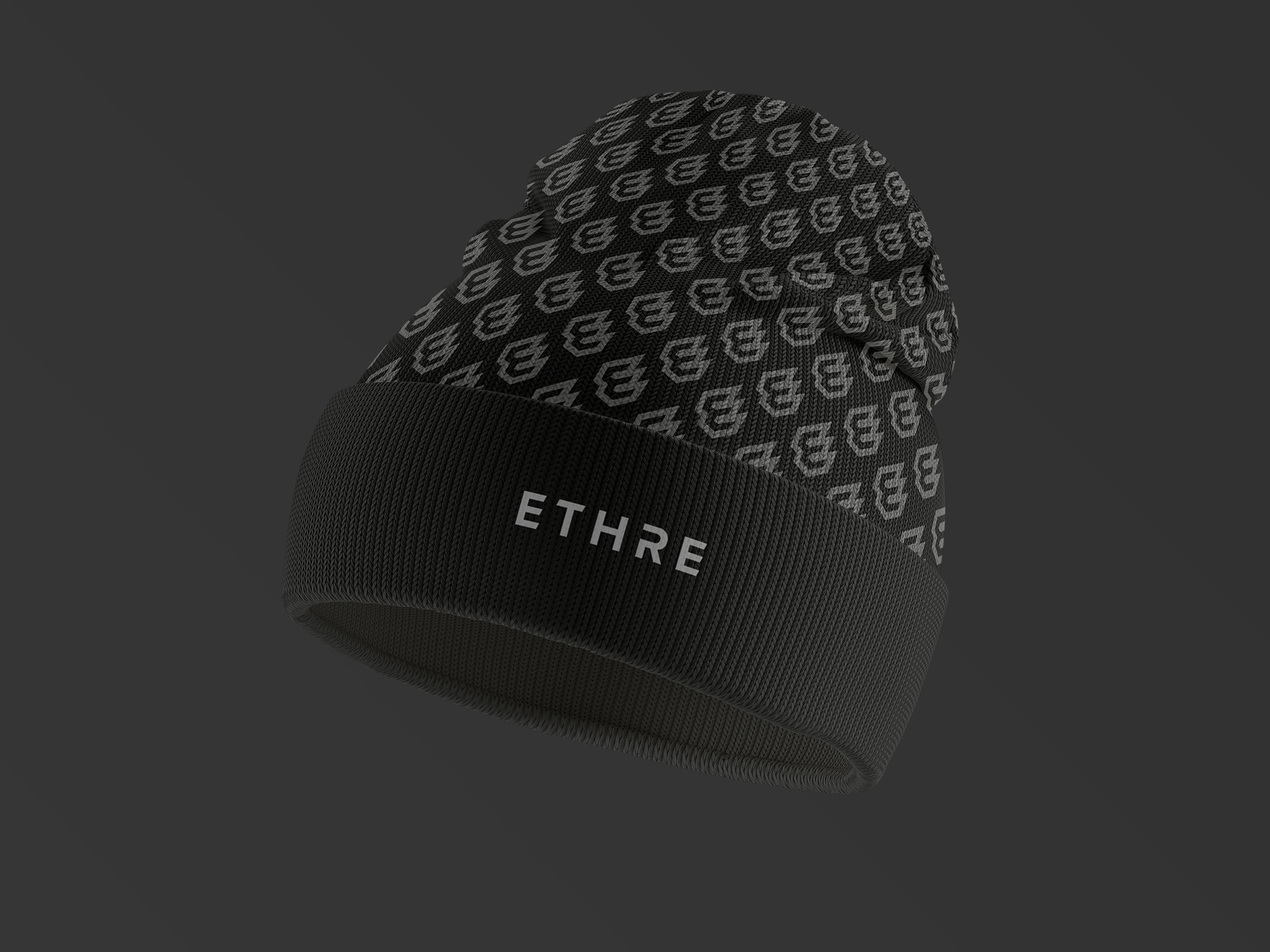
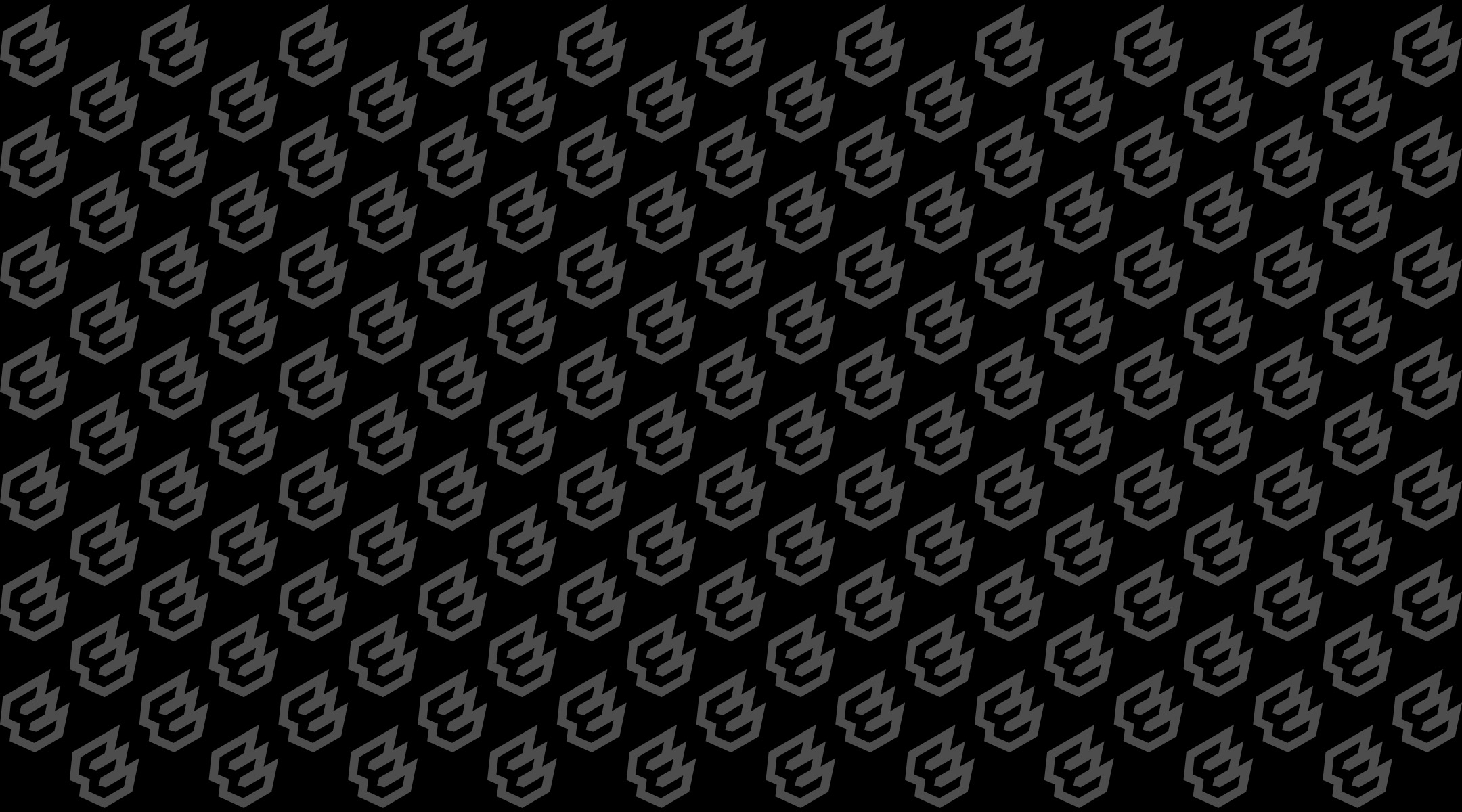
For a brand like this, it is very important to have a unique pattern that represents the identity of the brand. In this case, we have a special unique pattern made with the logomark of the brand. This pattern can be used on different products and places to make the identity system stronger.
BRAND COLOR
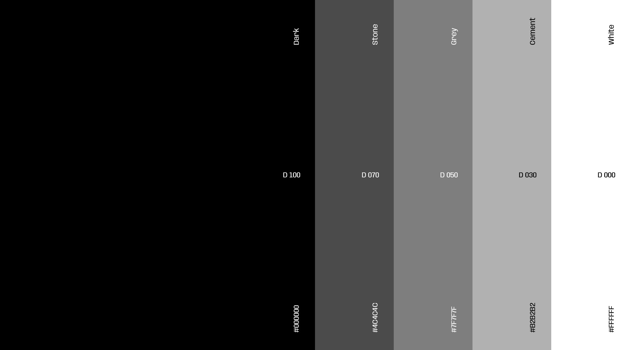
It is a must for a brand to have a color palette in its identity system to create a great impression. The same goes for ETHRE. This brand has a monochromatic color palette. As this is a fitness brand the black and white themed color is a perfect choice for it as black represents Power, Elegance, Strength, and Authority.
APPLICATIONS
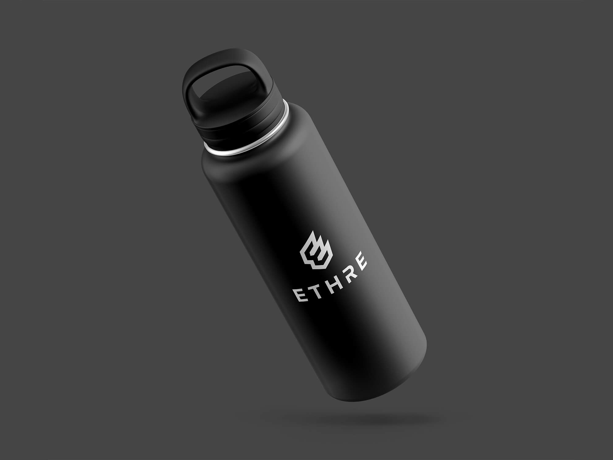
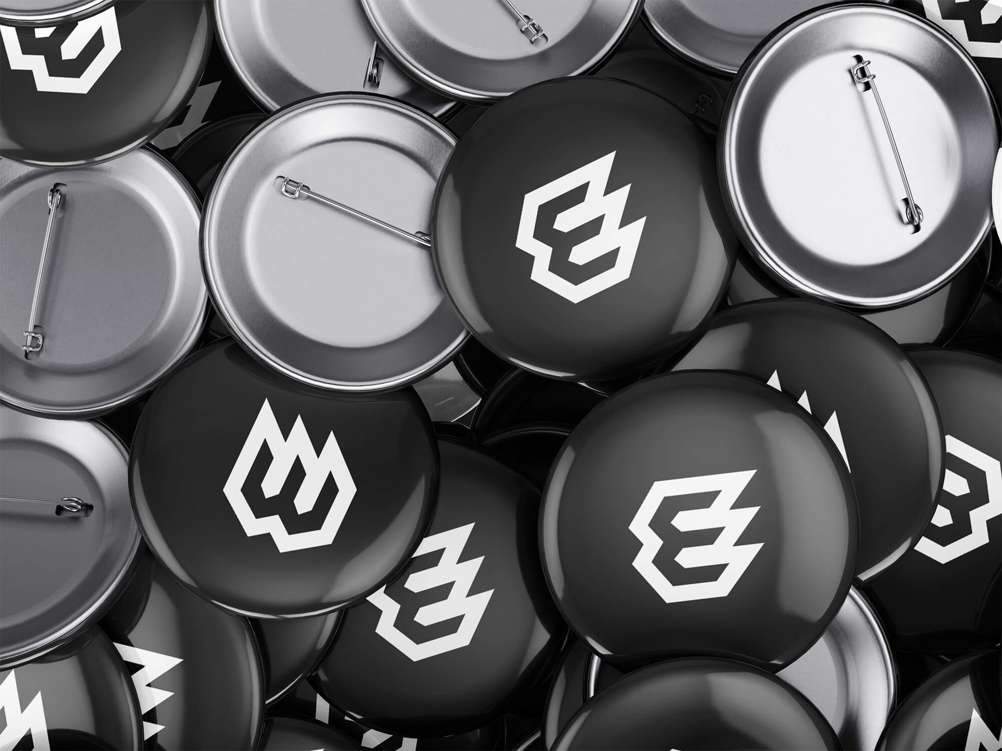
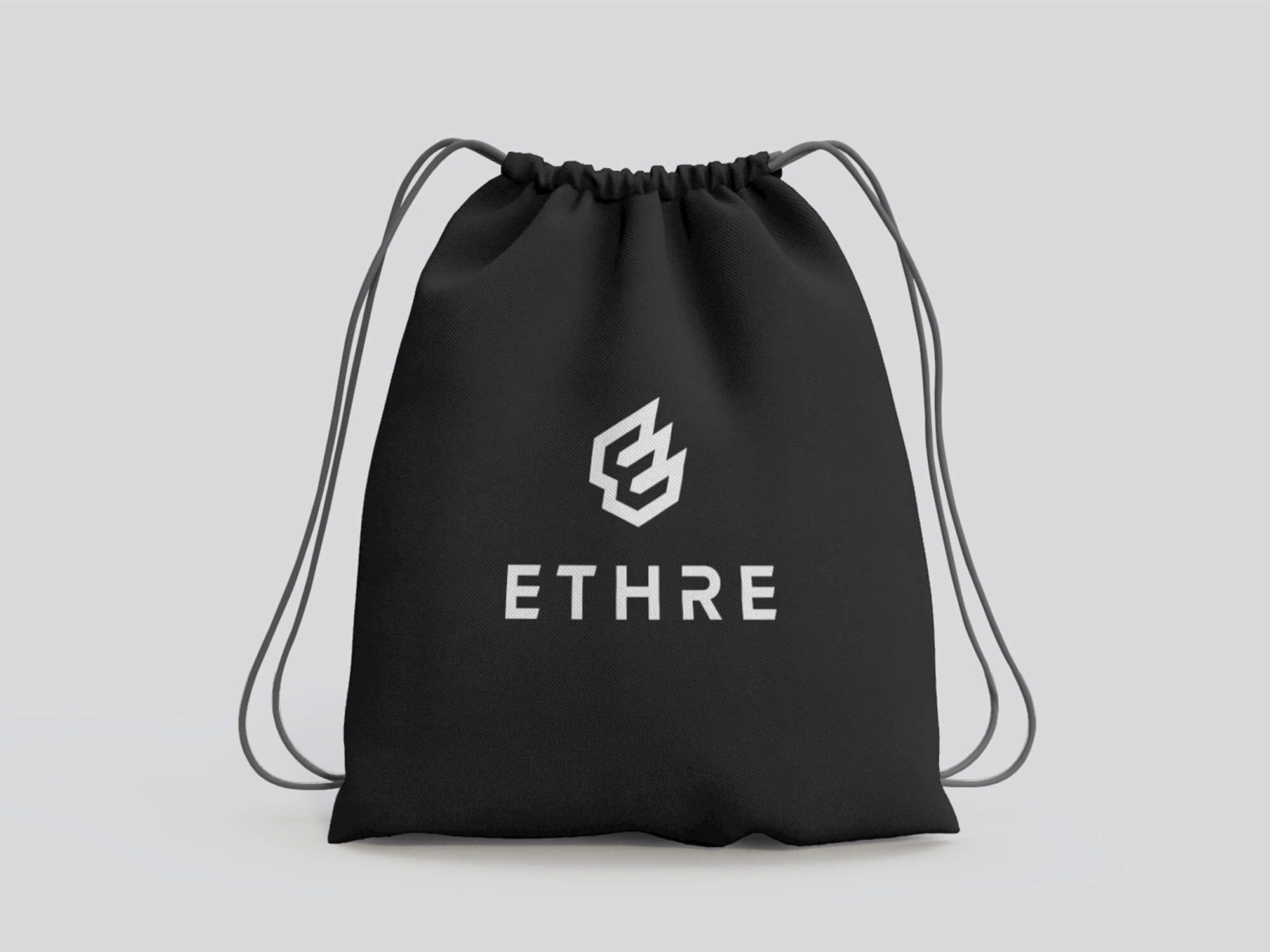
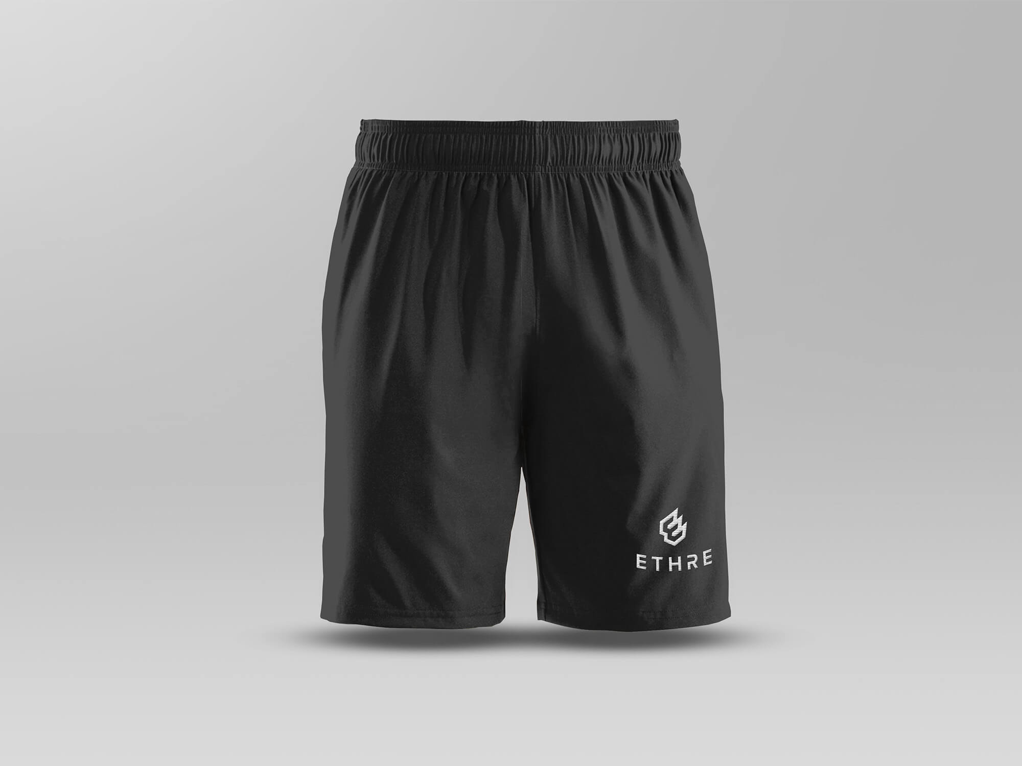
The brand application simply means using the branded elements on all of the marketing materials and custom products of the brand. This makes sure the identity of the brand is preserved and consistent all over the brand. This is the way to emotionally connect with the audience of the brand.

Consistency across all the different brand applications means the brand feels more trustworthy and reliable.  Here are some mockups to show how the ETHRE brand will look in a real-life use case scenario.
LET"S WORK

Need help with project?