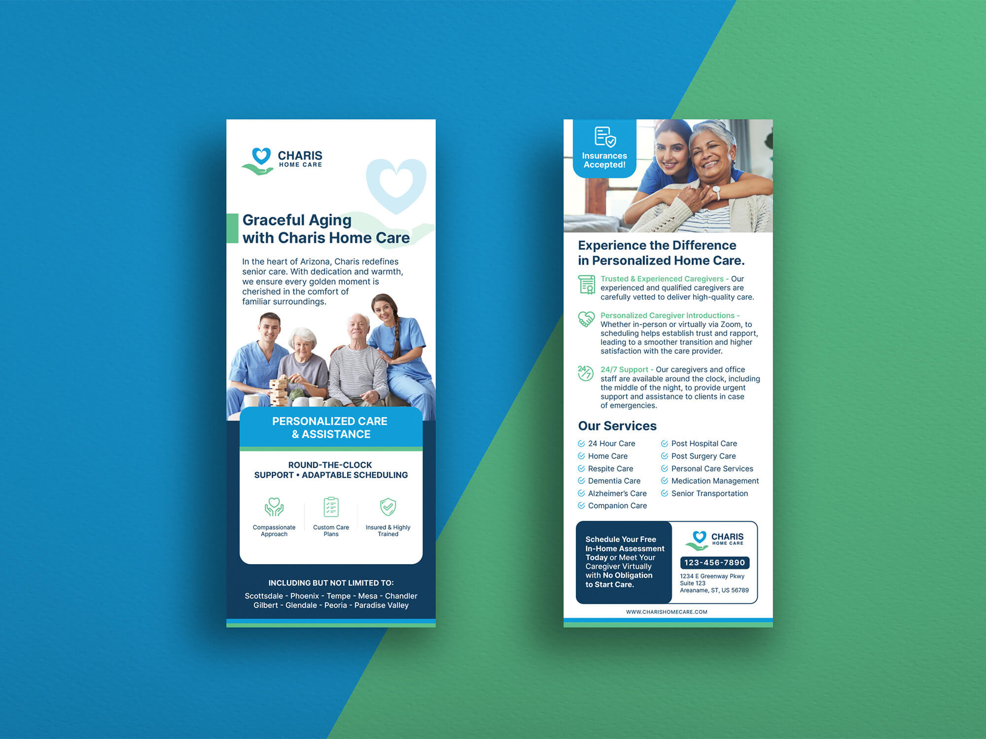
Charis Home Care Provides seniors with company and emotional support to ensure they never feel alone or isolated. Their warm, comfortable residence provides an alternative to traditional Assisted Living facilities, where long hallways and institutional meal options can be less than desirable. At Charis Home Care, they have a passion for creating moments of joy for their residents by providing care that is resident-centered and personalized.
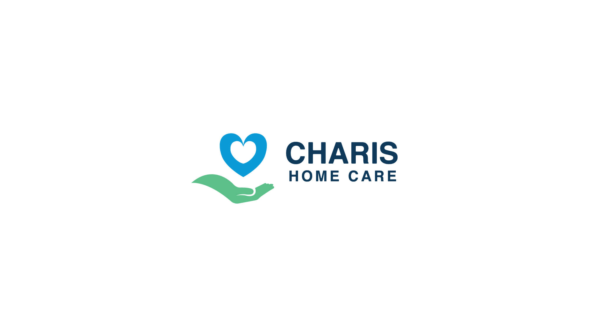
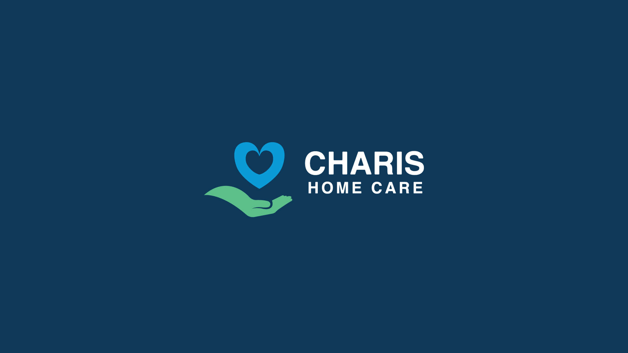
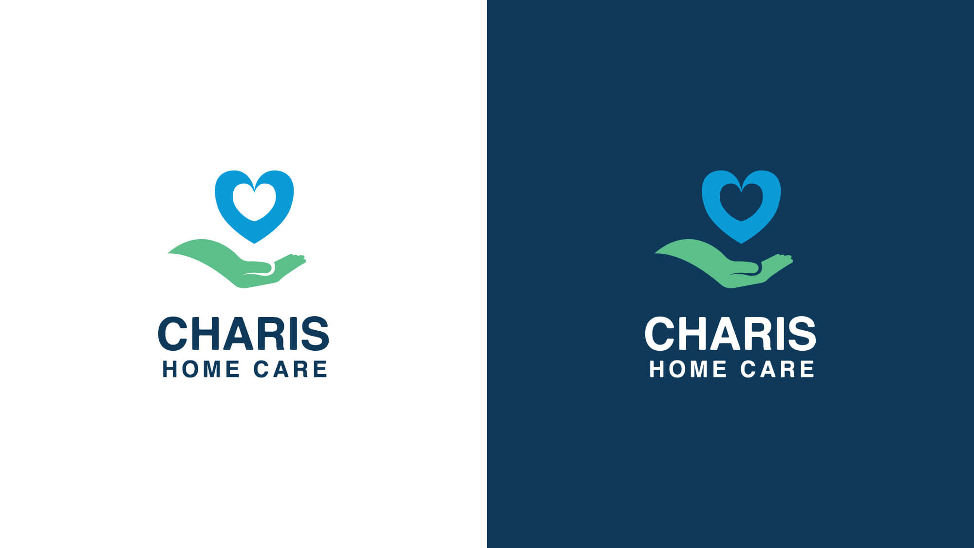
Brand Logo
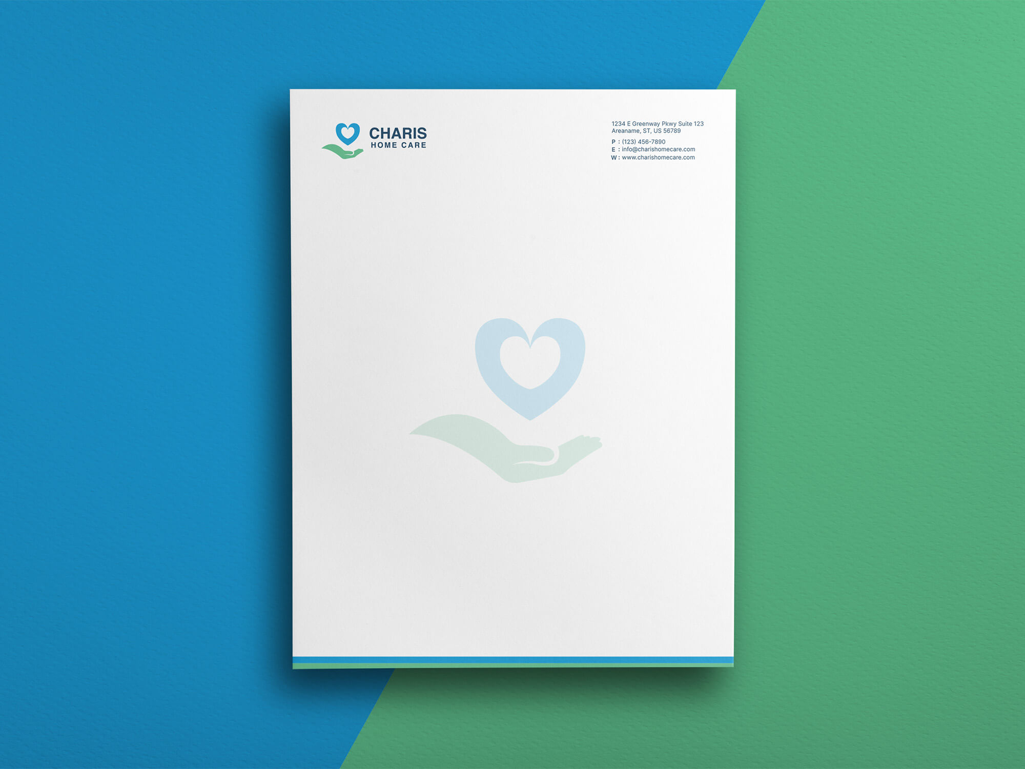
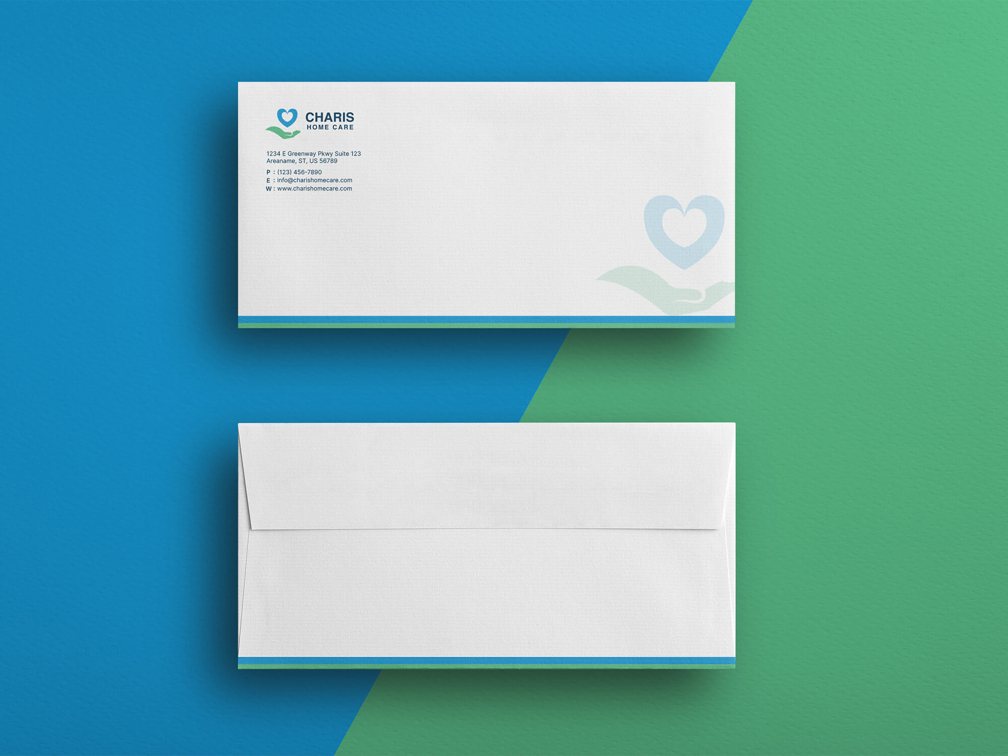
The Logo is a modern and iconic logo with a logomark and a logotype. The logomark has a heart and a hand symbol that represents love, care, and empathy. The hand is embracing the heart as if the caregiver is embracing the client with loving care.
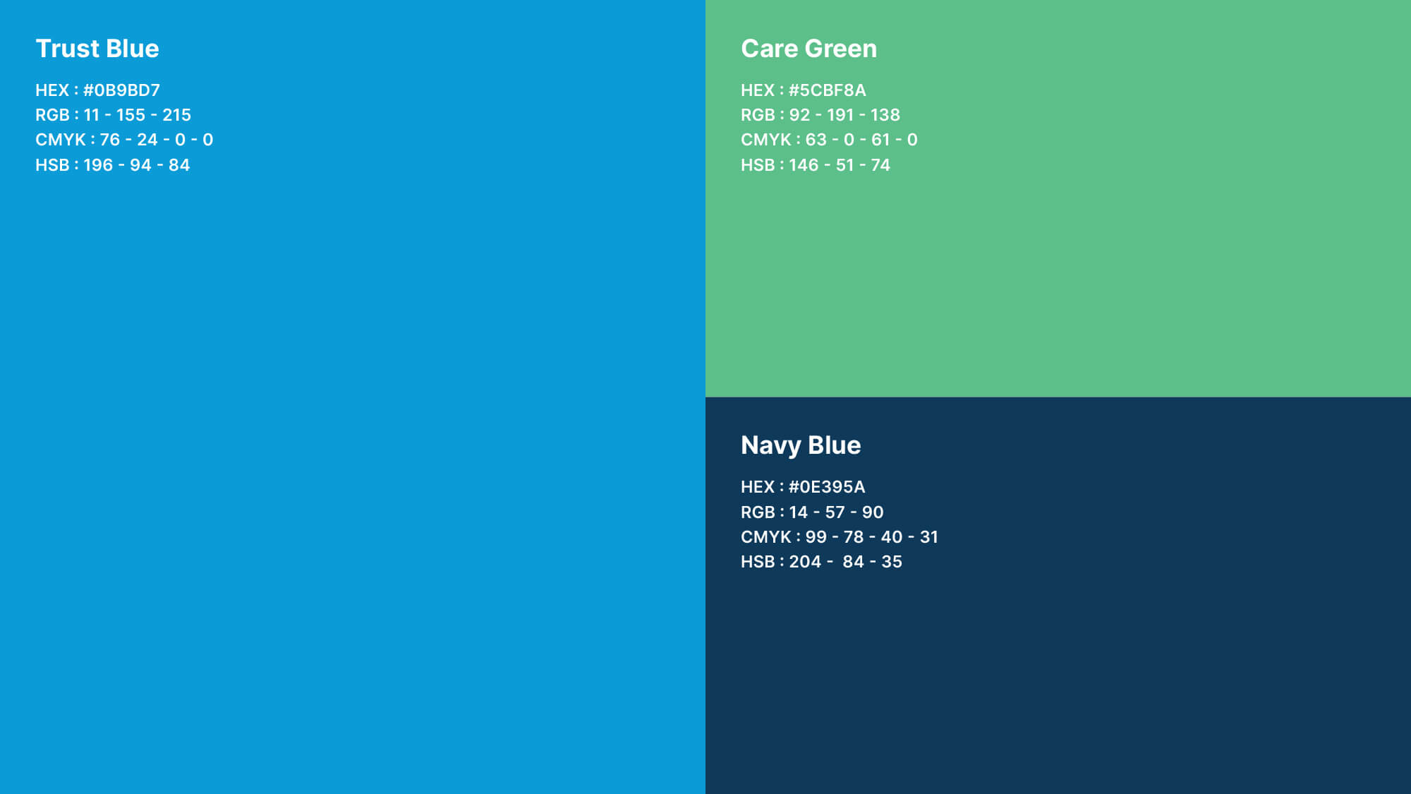
Brand Color
To make sure the brand has a consistent look in every aspect, we have to use some chosen colors. Just like every memorable brand, Charis Home Care also has a unique color palette. In the palette, we have Green, which represents life, growth, trust, and hope. We have Blue, which represents trust, security, loyalty, positivity, and calmness.
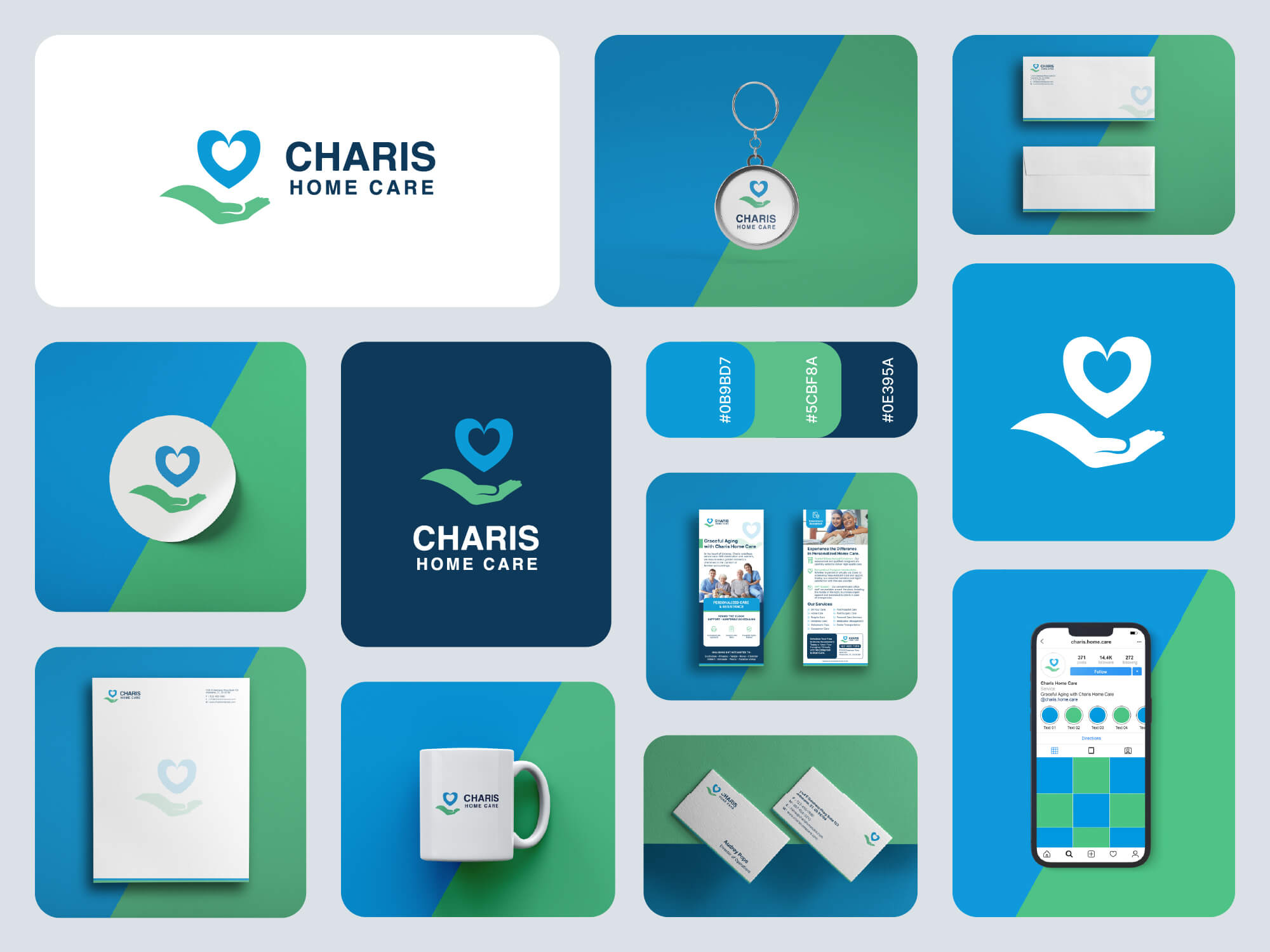
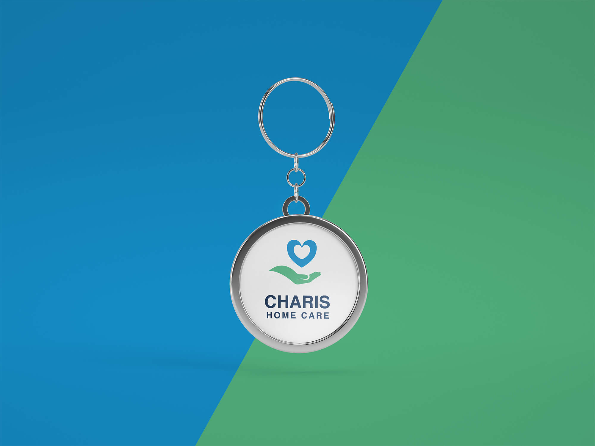
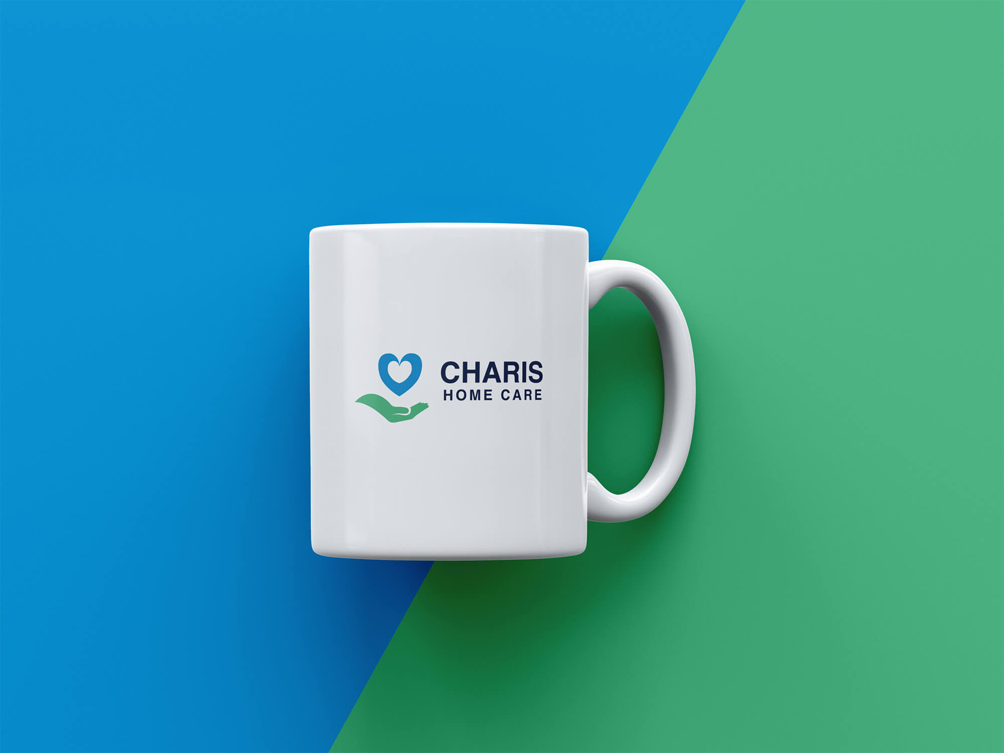
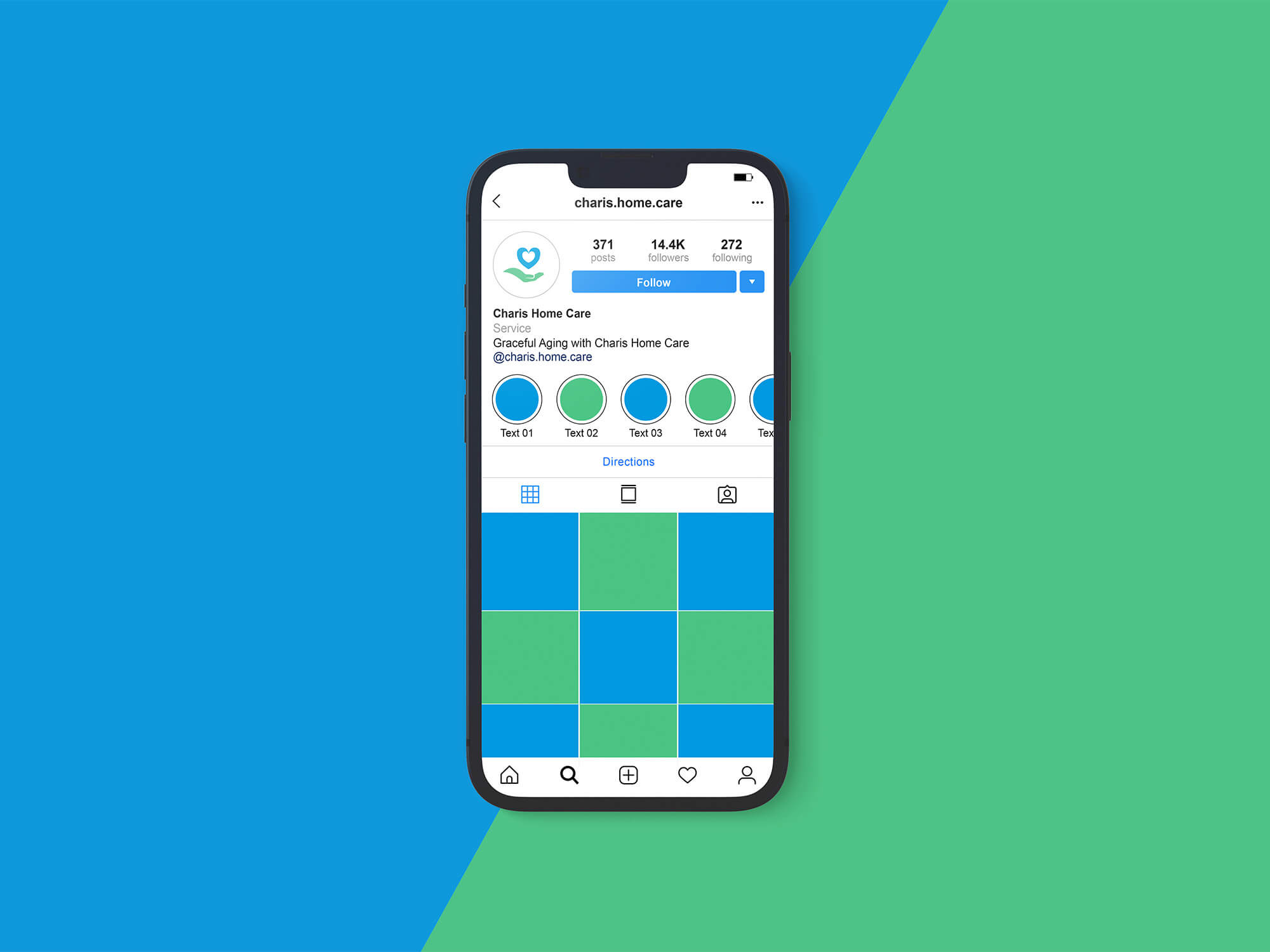
Brand Consistency
Visual consistency in every aspect is a must for every brand. From digital media to printed products, everything must have a consistent look & feel. This helps the brand to be attractive and memorable. Here are a few examples of how Charis Home Care can be represented with its personalized branded items.